 Fashion
Prints That Clash, Outfits That Work
By Sara Tilla
An unexpected colour pairing can make familiar clothes feel newly considered.
 WORDS BYToni MelaOctober 21, 2026
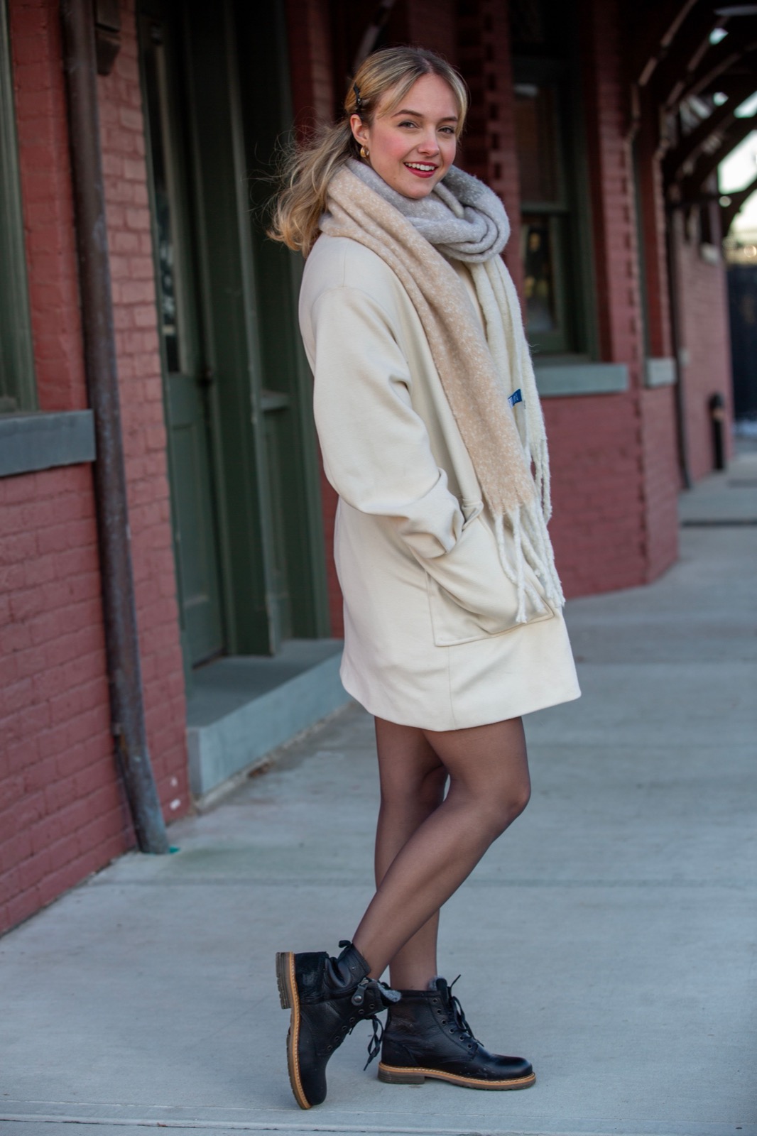
An unexpected colour pairing can make familiar clothes feel newly considered. The change does not require a brighter wardrobe overall. Sometimes it is a muted blue shirt beside dark brown trousers, or a narrow strip of lilac between a grey coat and a cream knit. The surprise comes from a relationship you have not used before. Once you begin looking for those relationships, colour becomes a practical way to rearrange what you own rather than a reason to replace it.
ELLE's coverage of colour blocking on the spring 2027 runways offers a useful prompt to experiment. The runway is designed to be seen at a distance and often uses a much larger dose of colour than everyday dressing requires. Our approach starts with smaller decisions: which two colours to place together, how much space each receives and what the rest of the outfit needs in order to feel settled.
Two colours rarely need equal space. A blue shirt with brown trousers gives each a substantial role, while a blue scarf with a brown coat creates a different hierarchy. Begin by choosing the colour you already feel comfortable wearing in quantity. Let that be the larger area. Add the unfamiliar shade in a smaller piece, then increase its presence only if you enjoy the result.
This is particularly helpful when experimenting with saturated colours. Purple trousers and a red sweater make a direct statement; a purple sweater with a red bag is more contained. Neither requires an explanation, but they create different levels of visual activity. Think about how much attention you want the outfit to attract on that particular day. Confidence does not always mean choosing the loudest possible version of an idea.
A pale blue shirt can bring lightness to brown trousers, while a darker blue knit can make the pairing feel more concentrated. Look at the brown carefully. A soft, greyish brown will behave differently from a warm chestnut or a deep chocolate. Try the pieces together before adding a third colour. A combination that seems predictable in words may feel unexpectedly rich once the actual fabrics meet.
For work, start with a blue shirt, brown trousers and shoes close to the trouser colour. For a relaxed day, exchange the shirt for a blue sweatshirt and keep the rest simple. If you want another layer, choose one that repeats a colour already present or introduces a quiet neutral. You do not need to find a perfectly matching brown bag. A clear difference in shade can feel more relaxed than a near match that never quite resolves.
Pink and olive can produce an interesting balance because neither needs to behave like a conventional neutral. A dusty pink shirt beside olive trousers feels different from a bright pink knit over a military-inspired skirt. Choose the version that fits your existing wardrobe. If the combination seems overly sweet, bring in a sharper line through the shoe, jacket or bag rather than abandoning the pink.
The proportion of colour matters here. An olive coat worn open over a pink top allows the pink to appear as a central panel. A pink scarf with an olive knit creates a smaller moment near the face. Keep the fabric finishes in mind too. Matte cotton and wool make the pairing feel grounded; a satin surface introduces more movement and reflection. You are choosing a mood as much as a pair of shades.
A pale yellow shirt can lift a burgundy skirt without requiring a bright contrast. The dark colour gives the outfit weight; the lighter one creates a place for the eye to rest. If you already own burgundy shoes, try them with a pale yellow knit and simple trousers before buying a larger burgundy piece. An accessory can be enough to establish whether you like the relationship.
Yellow can vary enormously under different lighting. Look at the garment in daylight if possible, especially when choosing between cream, butter and a more vivid shade. A yellow that feels calm beside burgundy might look sharper against black. This is not evidence that the garment is wrong. It simply means the surrounding colours change how you perceive it, which is exactly what makes pairing colours such an interesting tool.
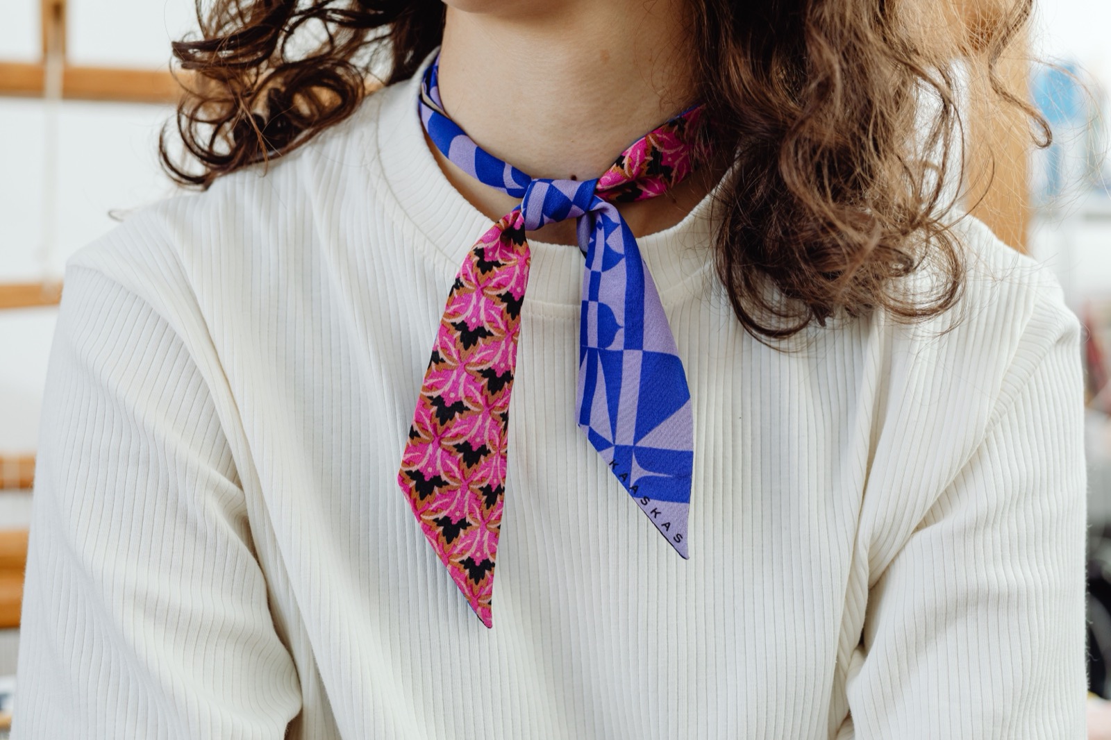
Lilac does not have to become the cheerful centre of an outfit. Beside grey, it can act as a soft interruption. Try a lilac shirt under a grey jacket, allowing the collar and cuffs to show, or a lilac knit with grey trousers. If the outfit feels too pale overall, add a darker shoe or bag to give it a more definite ending.
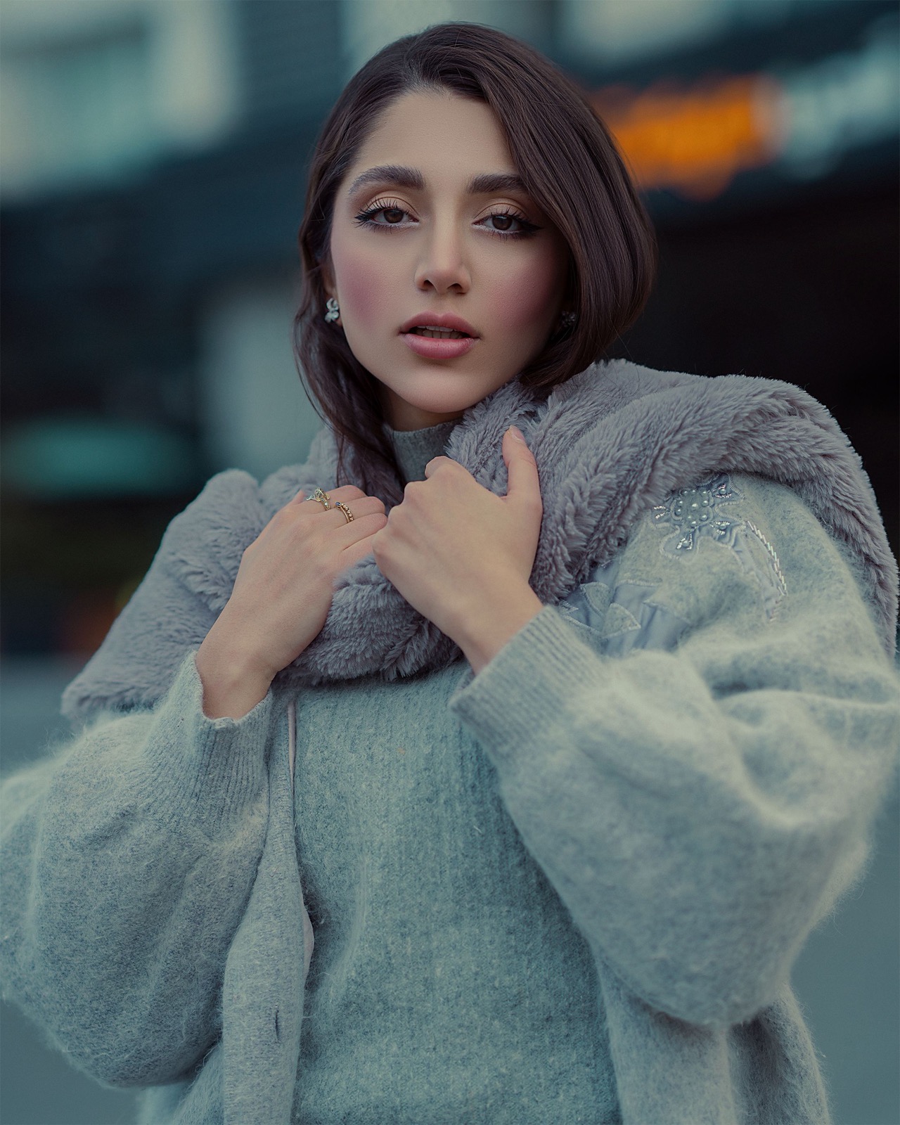
Consider the grey's temperature. Some greys lean towards blue; others have a brownish cast. Hold the actual garments together rather than relying on the colour names in your memory. A pairing that looks harmonious on a screen may feel flat in person, while an apparently awkward combination can come alive through texture. Ribbed knitwear beside smooth tailoring is often more interesting than two fabrics with identical surfaces.
A third colour should have a purpose. White or cream can separate two strong colours, especially at the neckline or shoe. A darker neutral can frame them. Another saturated shade can make the outfit more playful, but it also asks for a fresh decision about balance. Before adding it, look at the existing two-colour combination and identify what feels missing. If nothing is missing, stop there.
Accessories are not invisible in this calculation. Metal hardware, shoe soles, glasses and the lining of an open coat all contribute small areas of colour. You do not need to coordinate every detail, but noticing them can explain why an outfit already feels complete. Sometimes a gold buckle provides the warmth you were about to add with another garment. Sometimes a white trainer offers enough light to prevent darker shades from becoming visually heavy.
Choose three combinations from your own clothes and photograph them in the same place. Keep the shape of the outfit similar so that you can judge the colour relationship rather than being distracted by a different silhouette each time. Wear your favourite version for an ordinary activity. Notice whether you still like it once you have stopped examining it as an experiment.
Save the photograph with a short note about what made the pairing work: a pale colour near the face, a dark base, a repeated accent or two contrasting textures. That note becomes a useful starting point the next time you get dressed. Colour confidence grows through recognition. You begin to know which relationships feel natural to you, and you can return to them without asking whether a particular combination has been officially declared fashionable.
WINTER WARDROBE
Compare these current collections with the shapes and layers you already wear.
COS is a useful starting point when comparing a fine merino layer with a more substantial crew-neck or funnel-neck knit. Check the composition and care instructions on the individual item before choosing.
ARKET’s wool-coat category gives you several silhouettes to compare, from a shorter peacoat to belted and oversized shapes. The most useful choice is the one that accommodates your normal layers and daily routine.
OUR WRITERSToni MelaRead more from Toni Mela on Her & Bloom.
All stories by Toni Mela ↗