 Fashion
A Small Scarf Can Change Your Whole Look
By Andrea Hills
An outfit with two prints asks a slightly different question from an outfit with none.
 WORDS BYSara TillaOctober 21, 2026
An outfit with two prints asks a slightly different question from an outfit with none. Instead of asking whether every piece matches, it asks where the eye should travel. A striped shirt might lead you towards a floral skirt; a checked jacket might give a loose, painterly dress a firmer outline. The pleasure comes from the relationship between the pieces. You can build that relationship deliberately, without buying a wardrobe of statement clothes or memorising a set of fashionable exceptions.
Vogue's discussion of clashing prints places the idea in a street-style context. Our interest is what happens after the photograph: how to make a mixed-print outfit feel useful for work, lunch, a train journey or an ordinary afternoon. The most convincing combination is one you can wear comfortably, recognise as your own and put together again without needing the original reference image beside the mirror.
Start with the printed item you already reach for. It might be a blouse with a dense botanical pattern or trousers covered in a small check. Put it on with a plain companion first. This establishes the shape of the outfit before pattern becomes part of the decision. Notice where the waist sits, how much fabric gathers at the hip and whether the sleeve volume feels right. A second print cannot resolve a silhouette you dislike; it usually makes the unresolved part more noticeable.
Now replace the plain companion with something patterned. Give the original piece more visual space, either because its print is larger or because more of the garment is visible. A floral dress beneath an open striped shirt remains the main event. A narrow striped layer under a checked suit behaves more like punctuation. Neither arrangement is inherently better. The useful distinction is that two competing elements need not be equally loud to feel intentional.
Matching every shade can make the exercise unnecessarily restrictive. Look instead for one colour that appears somewhere in both garments. A little cream in a floral print can connect to the pale ground of a striped shirt. A rust line in a check can pick up a warm detail in an abstract scarf. The colours do not have to be identical, especially when the pieces sit at different points on the body.
Lay the garments together in daylight before deciding that they clash beyond repair. Artificial lighting can make neighbouring colours appear strangely disconnected. Then look at the entire outfit from a few steps away. The small connecting colour may disappear at that distance, leaving you with a relationship based on lightness or darkness instead. That can work just as well. Think of colour as an available tool rather than a rule that must be satisfied before leaving the house.

A large floral beside a tiny check offers the eye two different rhythms. The bigger motif reads as an image, while the smaller one can almost become a texture. Two equally dense prints may feel busier because both ask to be examined closely. If that is the effect you enjoy, keep it. If you want a quieter result, change the scale of one piece before abandoning the idea of wearing prints together.
Spacing matters as much as the size of the motif. Widely separated dots leave breathing room; tightly packed dots create a more continuous surface. A striped top with plenty of plain fabric between the lines can sit comfortably beside an intricate skirt. When the combination feels crowded, a plain belt, a visible cuff or an open neckline can provide a small pause. You are editing the amount of information, not trying to remove all the energy.
For a working day, try a small-check jacket over a striped shirt with plain trousers. Keep the jacket open so that the stripes form a narrow central panel. If the shirt and jacket both have strong collars, soften one: leave the shirt's top button undone or choose a jacket with a simpler lapel. Finish with a bag large enough for the day rather than another decorative object competing for attention.
For a relaxed weekend, wear a floral skirt with a striped knit. The proportions can be loose and comfortable, but check where the sweater finishes. A hem landing at the widest part of the skirt may create a shape you enjoy, or it may obscure the line you wanted. Try a partial tuck, a shorter knit or an open cardigan. The pattern combination can stay exactly the same while the outfit changes through its outline.
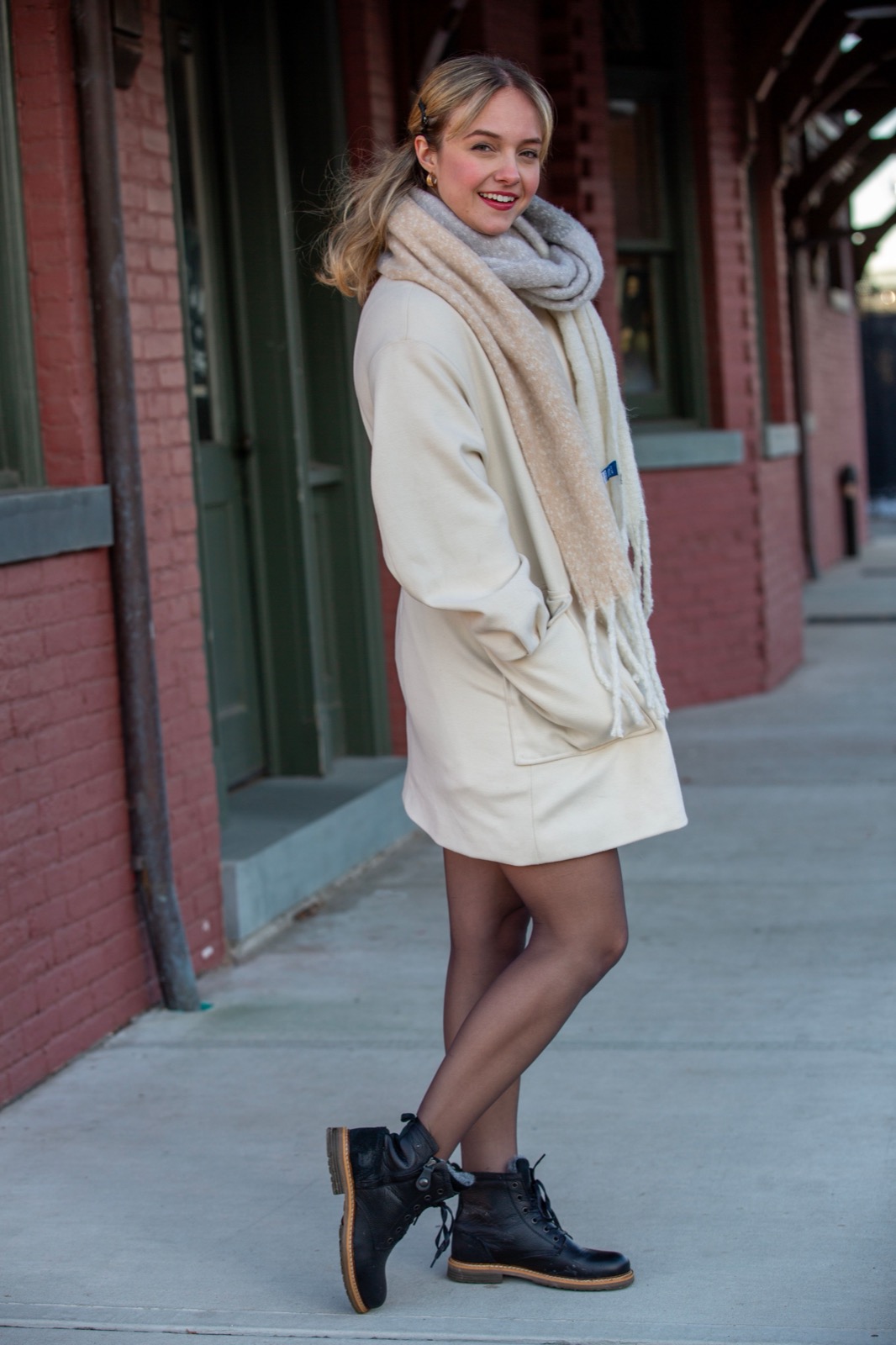
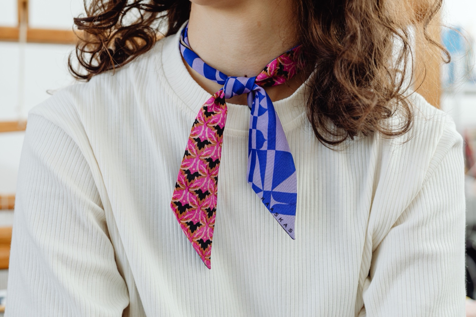
For an evening, a printed dress and patterned scarf can be enough. Fold the scarf into a narrow band, wear it loosely at the neck or tie it to the bag you already planned to carry. This gives you a small, reversible experiment. You can remove the scarf if it becomes irritating, and the rest of the outfit still works. There is no requirement to make your first mixed-print look the most complicated one.
Shoes do not need to disappear, but they should have a clear job. A simple shoe can steady an energetic outfit; a coloured shoe can repeat one of its shades. Adding an unrelated print introduces another conversation. Before doing that, ask whether the outfit needs it or whether you are adding something because the earlier choices made you feel that everything now has to be expressive.
Jewellery offers another way to control the mood. A plain hoop beside a busy collar can feel sufficient. A sculptural earring may work better with an open neckline and the scarf removed. Try taking one accessory away before adding another. This is especially useful when the garments have their own hardware, contrast buttons or decorative stitching. Those details already contribute to the final impression, even if you did not originally count them as accessories.
Take a quick photograph after you have moved around in the outfit, not only when you have arranged yourself perfectly in front of the mirror. Notice whether the sleeve stays where you want it, whether the scarf slips and whether the layers become cumbersome when you sit. Save the combinations that remain enjoyable after these ordinary tests. A small album of your own successful outfits is more useful than an endless collection of other people's clothes.
Eventually, a combination that once seemed adventurous may become familiar enough to wear without discussion. That is a good moment to change one element: switch the shoe, introduce a different background colour or exchange the large print for a smaller one. Personal style develops through these adjustments. The aim is not to prove that you can handle more pattern. It is to make the clothes you already like speak to each other in a way you want to hear.
WINTER WARDROBE
Compare these current collections with the shapes and layers you already wear.
COS is a useful starting point when comparing a fine merino layer with a more substantial crew-neck or funnel-neck knit. Check the composition and care instructions on the individual item before choosing.
ARKET’s wool-coat category gives you several silhouettes to compare, from a shorter peacoat to belted and oversized shapes. The most useful choice is the one that accommodates your normal layers and daily routine.
OUR WRITERSSara TillaRead more from Sara Tilla on Her & Bloom.
All stories by Sara Tilla ↗